Tech stack
Backend:
- Services written in Python (
Flask,aiohttp, AsyncIO, multi-threaded); - Inter-service communication: RESTful API, WebSockets, AMPQ (RabbitMQ), S3 API (AWS or other S3-compatible).
- DB and storage: SQLite (services’ and tasks’ state), Ceph with RGW (S3-compatible API).
- Shell scripts (bash), Docker, GitLab CI, Traefik.
Frontend:
- Vite, JavaScript, React.js, Redux.js (RTK), D3.js, MaterialUI, and CSS.
Overview
Simple Engine for Inter-site Stream Access (SEISA*) is the initiative I started at the KAGRA observatory to create a tool that gives a modern approach to access and collaboratively work with the observatory data streams through a web app, APIs, and other clients (that use these APIs) if necessary.
*Also, I liked this abbreviation because the Japanese name 星鎖 has the same pronunciation, with characters 星 (sei) - “a star” and 鎖 (sa) - “to connect” having meanings that can be associated with the purpose of the system.
Similar to commodity SaaS tools (like Google Docs), it allows users to store their session configurations (documents) on the server - the list of data channels, time intervals, labels, etc. Since our scientific collaboration consists of members from several universities across Asia, this tool would enable them to easily share and discuss their interactive plots. By allowing newcomers into the group to start collaborating with the on-site researchers remotely from their campuses, it could also help make the onboarding experience for them more user friendly.
Previously, extracting instrument data at the observatory required using software tools developed 10+ years ago by other groups. Furthermore, it required
- either using PC terminals at the lab (that have these software tools installed and configured);
- from regular work PCs, using these PC terminals with a remote desktop connection (which introduces additional security risks due to allowing unnecessary read-write access to the observatory equipment, i.e. enabling full remote controlling capability even when doing tasks that do not require controlling the equipment);
- or writing custom scripts for reading instrument data and submitting them for execution over SSH connections to HPC clusters.
These old tools make working with instrument data more time-consuming than it should be for existing on-site researchers, and it also affects the lab’s ability to excite/recruit talented students and researchers to join the on-site research team and the time needed to train them. One reason for the latter is the inability to show new researchers hands-on experience working with real-time instrument data before either bringing them on-site for an extended stay (scheduling expensive and time-consuming travels) or setting up special PC terminals and proxying the lab network to their campuses (consuming a trained staff/researcher’s time to manage additional networks and PCs with special software at their institutions).
Contrary to them, this new software tool would increase the work efficiencies of current researchers and, by making the onboarding experience into experimental research more user-friendly, would make the lab and the research area more attractive to prospective contributors in the future. Also, since this system is developed in-house (as opposed to tools developed elsewhere) and with more modern technologies, it is more maintainable and allows the team to update/expand its functionality to better fit our needs.
Design
Documents linked below explain the design of the system as it developed.
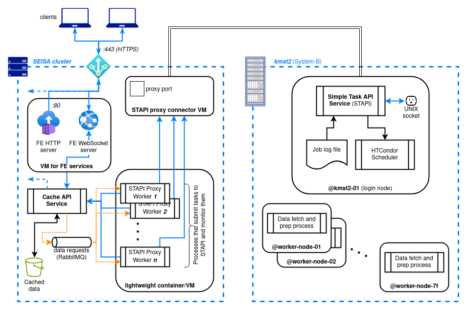
- Poster: dev status report 1 - Gives a high-level overview of the system architecture.
- Poster: dev status report 2 - Explains the components and interfaces of the system used for fetching data from the remote long-term storage.
Web App
Below are screencast demos (originally prepared for internal progress reports) that show the user interface functionality at various stages during the development.
Demo 1 (early UI draft, shows configuration persistency)
Audio: no | Captions: no | Duration: 3:45 | Size: 23 MiB
The goal of this demo was to show an early user interface and how changes to boards (i.e. “documents”) and figures within them (e.g., editing descriptions, data intervals) from the web app are persisted on the server. These “documents” are accessed via a lightweight RESTful API service wrapped over a SQLite database (the configuratoins are stored as JSON BLOBs). At this stage, we can also see:
- Channel data is being fetched from the server;
- Time-series data being plotted in D3.js-based components;
- The UI is still in the early development stage: many debug buttons are visible, and the chart (figure) interaction UI is still very basic and not intuitive.
Demo 2 (real-time UI updates, caching, data repackaging)
Audio: no | Captions: yes | Duration: 10:37 | Size: 123 MiB
The original goal of this demo was to demonstrate the newly implemented data fetching framework from the remote long-term storage cluster (described in the second poster above). In addition to that, several other updates happened since Demo 1:
- The UI is slightly more fleshed out compared to Demo 1.
- The two browser windows represent different users opening the same “board” (document). User sessions are managed with JWT tokens.
- Client states are handled with Redux.js (RTK); real-time updates transmitted over WebSocket.
- The caching service reduces inter-site data transmission. Notice that at @7:10 in the demo, because the time interval of the newly created data request overlaps with the previously requested data (from the same channel), the system shows the portion of the precached data as ready (green in the fetching progress) and does not queue it for fetching from the remote cluster.
- The final three minutes of the screencast show the usage of one of the interactive RESTful API docs pages to do the cleanup after the demo.
Additional Notes
The system is intended for internal use within the KAGRA scientific collaboration. Therefore, some of the concepts the GW research community members are expected to understand at a glance, such as GPS seconds, channels, are treated as common knowledge and not explained in the posters and demos above. For those wondering, below are some details about charts and other elements in the web app demos:
- GW observatory real-time systems continuously output various sensor measurements (and derived values) as numerical time-series streams denoted by their channel names, e.g.
K1:LSC-ALS_CARM_OUT_DQ. - Signals are timestamped with GPS time (a time scale similar to UNIX time), so the x-axis in the charts shows GPS time in seconds.
.gwf(gravitational wave file) is a binary file format that stores GW channel data..csvis a regular comma-separated-values file.- For a selected time interval, depending on the particular channel the size of resulting data files could vary drastically - channels have sampling rates from one sample per minute up to 65536 samples per second. Therefore, estimating the resulting data size before submitting the pre-caching (from the remote server) and repackaging requests is useful to help determine a reasonable amount of data to select for analysis.
- At the same time, information needed for visualization in the web UI are transmitted much quicker, because unlike
.csvand.gwffiles, the UI views receive data points with a reduced rate. Data reduction is done upstream (early) in the pipeline to reduce load on the network bandwidth and cache space. Which also improves chart viewing/navigation experience for the users.